On the other day, iCloud has been introduced to the world and it became a big topic of conversation. The design of icon is refined as ever. Let's think about why it looks so beautiful. Changing the point of view a little, I'll try to find out the reason of its beauty by focusing on icon design itself.
At first, let's take a look at its appearance.
Its shape is balanced while the outline is irregular. It may looks easy to settle the whole shape as cloud-shaped with simplicity and balance, however, it's not that easy. It's actually a refined design.
We can't approach the reason of beauty only by just looking at. So, let's peer into its design.
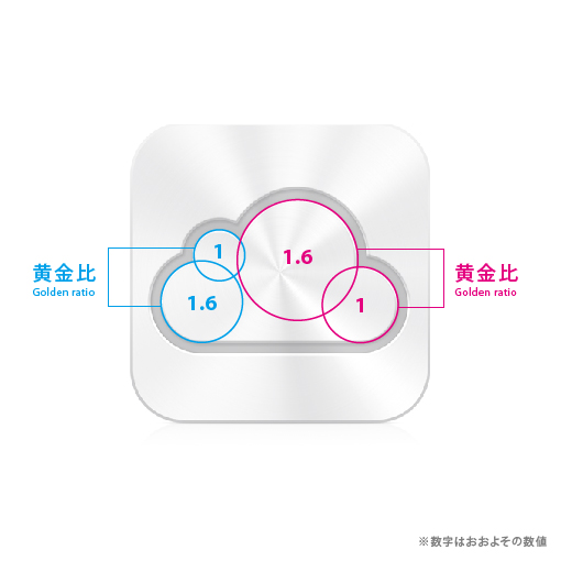
As some of you may already notice, there are four circles hidden in the whole shape. At first glance, the curve looks irregular. Although, if you look at it further, it turns out that it has a balanced shape composed of precise circled.
In short, it tells that the beauty of icon comes out of the geometry. However, it's questionable that aligning circles at random can produce the balanced design.
So, I explored it further and measured the diameter of circles.
Surprisingly, the ratio of two pair of circles is 1:1.6, which is close to the golden ration.
Furthermore, I measured the ratio of the whole cloud.
It's truly "One more thing".
It's shaped as perfect design which casts its beauty on our unconsciousness by utilizing fundamental principle such as the golden ratio as well as the geometry.
To summarize...
•Geometrically-set curves generates the balanced shape.
•Applying certain law to random shapes brings the balanced design in whole.
Simple, but profound.
Awesome Apple's design philosophy.
Original Japanese article is here.
(Uploaded on June 09.)
Tweet


